We can read this image with multiple perspectives. Literally or in a denotative sense we understand the image to be a room full of babies but with the aid of the caption and our own context, we see it through a connotative lens. It ultimately becomes a representation of racial discrimination, in relation to the stereotypes that coloured people face in the work force (still to this day). Another angle indicated in this image is the gender stereotypes of women, so typically seen as domestic workers.
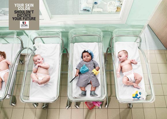
This is a French advertisement from 2010 that confronts racial stereotypes through the use of innocent, infant children. LICRA (the Ligue Internationale Contre le Racisme et l’Antisémitisme; International league against racism and antisemitism) worked with the Publicis Conseil of Paris to conquer the stereotypes that so commonly mould people’s perceptions about themselves and culture.
The caption, “your skin colour shouldn’t dictate your future” contributes to the importance of this advertisement in representing the faults in society towards casting such labels. The child centred is a coloured female baby who is dressed as a cleaner. It is the focal point as it is the main message to be sent. Not only does it challenge the typical racial stereotype towards employment but also the gender stereotype towards women as maids.
Children are the future of society, in this advertisement they act as the motif for change. The fellow babies are all male and they simply watch as the stereotypes continue. This signifies the joint effort necessary to overcome such solid stereotypes. LICRA is sending a clear message about how stereotypes leave a mark on the society today as well as in the future.
This advertisement wasn’t ignored, quite the opposite. It received international attention, including a trophy at the 2010 Cresta Awards. The Cresta Awards recognise original pieces of advertising, giving praise internationally. Their main aim “…to honour an absolute standard of creative excellence”, this ad although very creative, it also very political as it tests our awareness of stereotypes.
Stereotypes are often disregarded and shifted to the side as so many of them are just accepted. The key message is that there should be equal opportunities for all without prejudice. This advertisement represents LICRA’s entire aim for their organisation as well as the social issue regarding gender and racial stereotypes. Now that I can fully grasp the concept of semiotics (the study of signs), I see advertisements as just as complex and multifaceted. We can read novels, why not images too?

[Well, Gaston pictures can be read too because they’re texts.]
References:
Simple Research of Cresta Awards: http://cresta-awards.com/About.aspx
Note: Feel free to click on each image for a link to where I found it!

Leave a reply to sophemacy Cancel reply